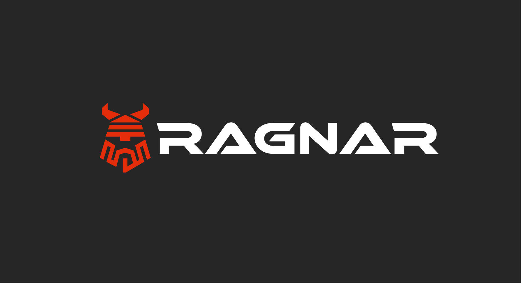
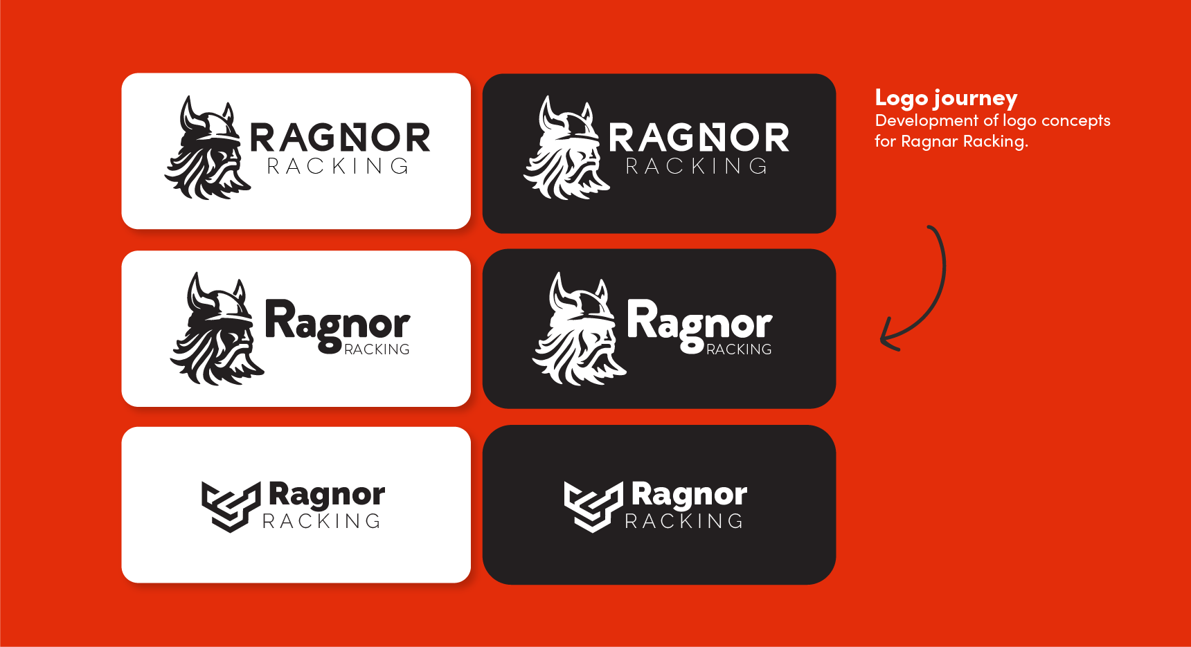
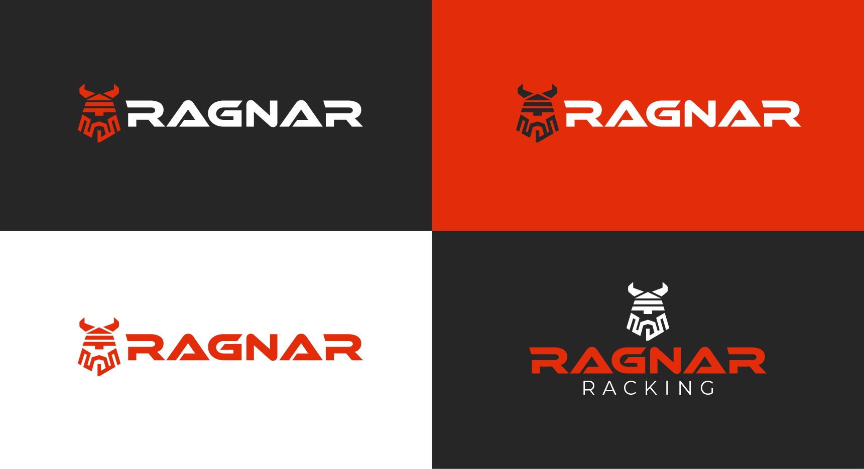
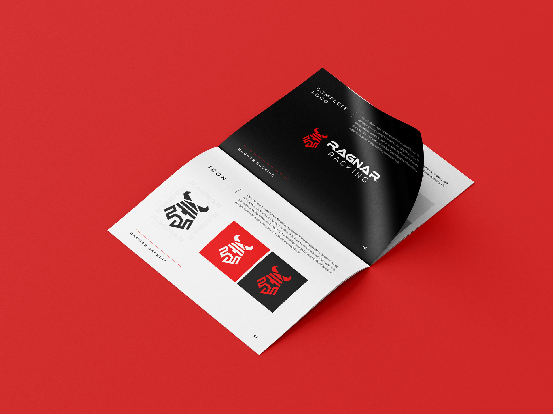
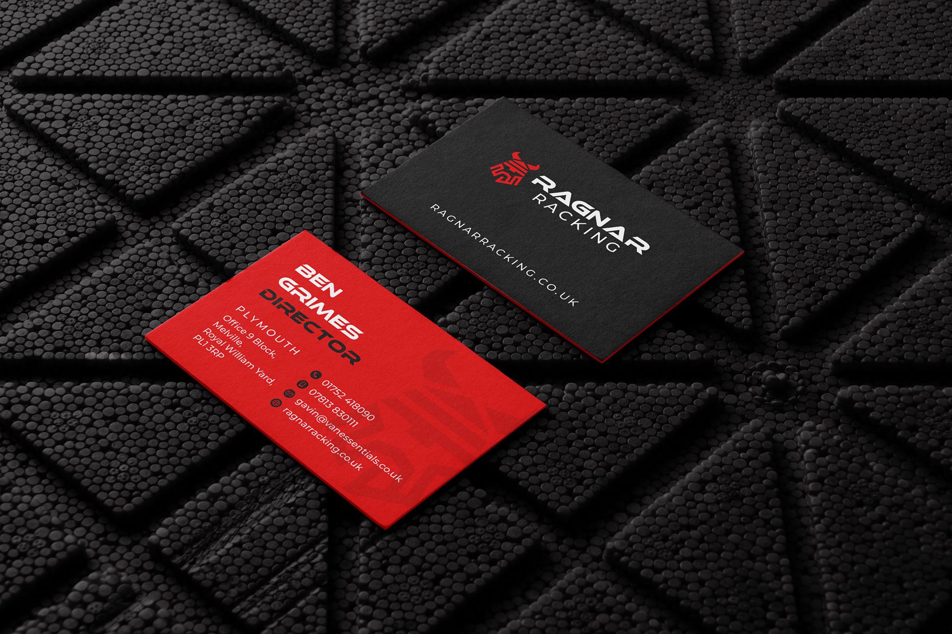
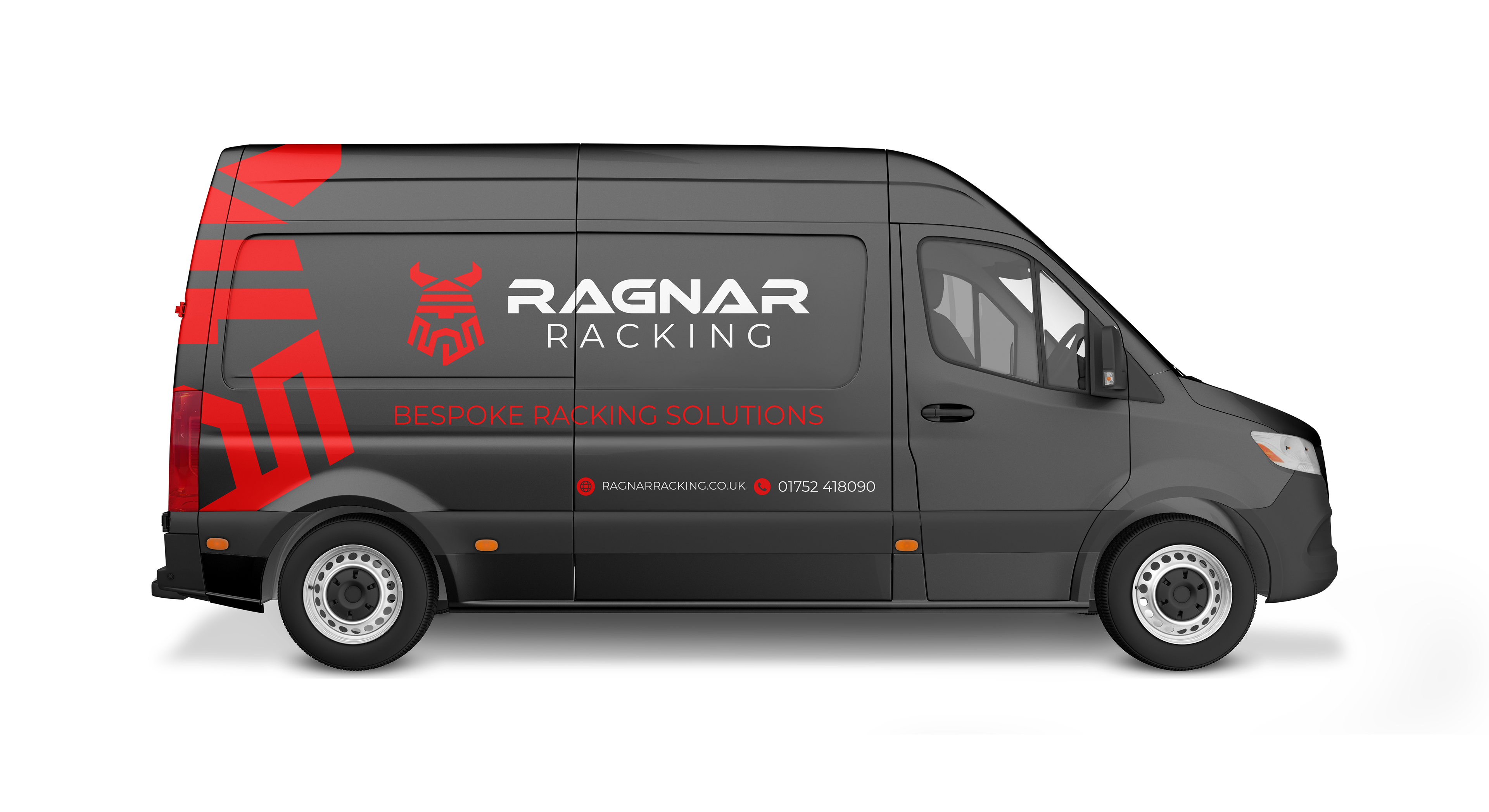
To develop the Ragnar Racking brand, I conducted extensive competitor and consumer research to identify market gaps and consumer preferences, ensuring that the brand stood out while also meeting customer needs. I used my branding expertise to create a unique and memorable identity with a distinct Viking style. Using Adobe Suite, I created a bold, angular font inspired by ancient runes to evoke strength and heritage, as well as an icon featuring a stylised Viking helmet to reinforce the theme. The use of red in the colour palette was deliberate, representing power, energy, and determination, resulting in a striking and cohesive brand identity that resonates strongly with the target audience and positions Ragnar Racking prominently in the market.