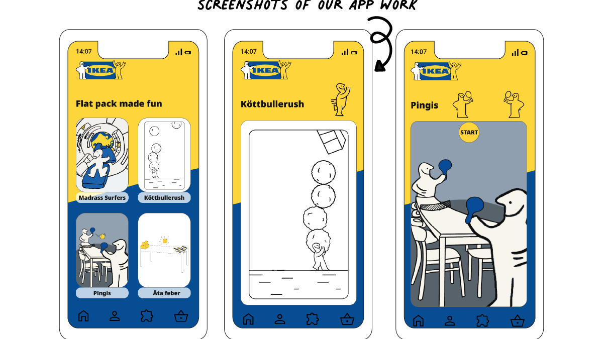
REFLECTION
Designing a menu layout for print at Elvira's Cafe was a stimulating journey of creative expression and meticulous planning. The endeavor demanded a delicate balance between aesthetics and practicality, as the menu needed to be both visually engaging and intuitively organised.
Delving into this project, I initially immersed myself in understanding the essence of Elvira's Cafe – its ambiance, cuisine, and the unique experience it offered.
As I sculpted the layout, I aimed to capture the cafe's character while maintaining a seamless flow of information. Each element, from typography to color palette, was chosen with purpose.
The layout's visual hierarchy played a pivotal role. Headings were artfully placed to guide attention, while images were strategically integrated to complement descriptions.
Throughout the design process, reflections on usability were paramount. I considered the customer's perspective, ensuring that the menu layout was not only visually appealing but also user-friendly. Clarity in categorisation were key to facilitating an enjoyable experience for customers.
Upon completion, witnessing the tangible embodiment of my creative efforts in the form of a printed menu was undeniably gratifying. It was a testament to the amalgamation of artistic vision, branding, and the café's unique identity.